As a B2B SEO agency founder, I’ve helped design and optimize countless landing pages for companies across different industries.
In this article, I’ve rounded up some of the best B2B landing page examples from current clients that truly get it right.
Whether you’re creating your first lead-generation page or refining an existing one, you’ll find plenty of design and copywriting principles to apply to your own landing page.
B2B SaaS Product Page Examples
Product pages in B2B SaaS carry a specific burden: they have to make a fairly abstract piece of software feel tangible and real to someone who hasn’t touched it yet.
The best ones do this with motion, specificity, and social proof layered in at exactly the right moments.
Resource Guru’s Timesheets
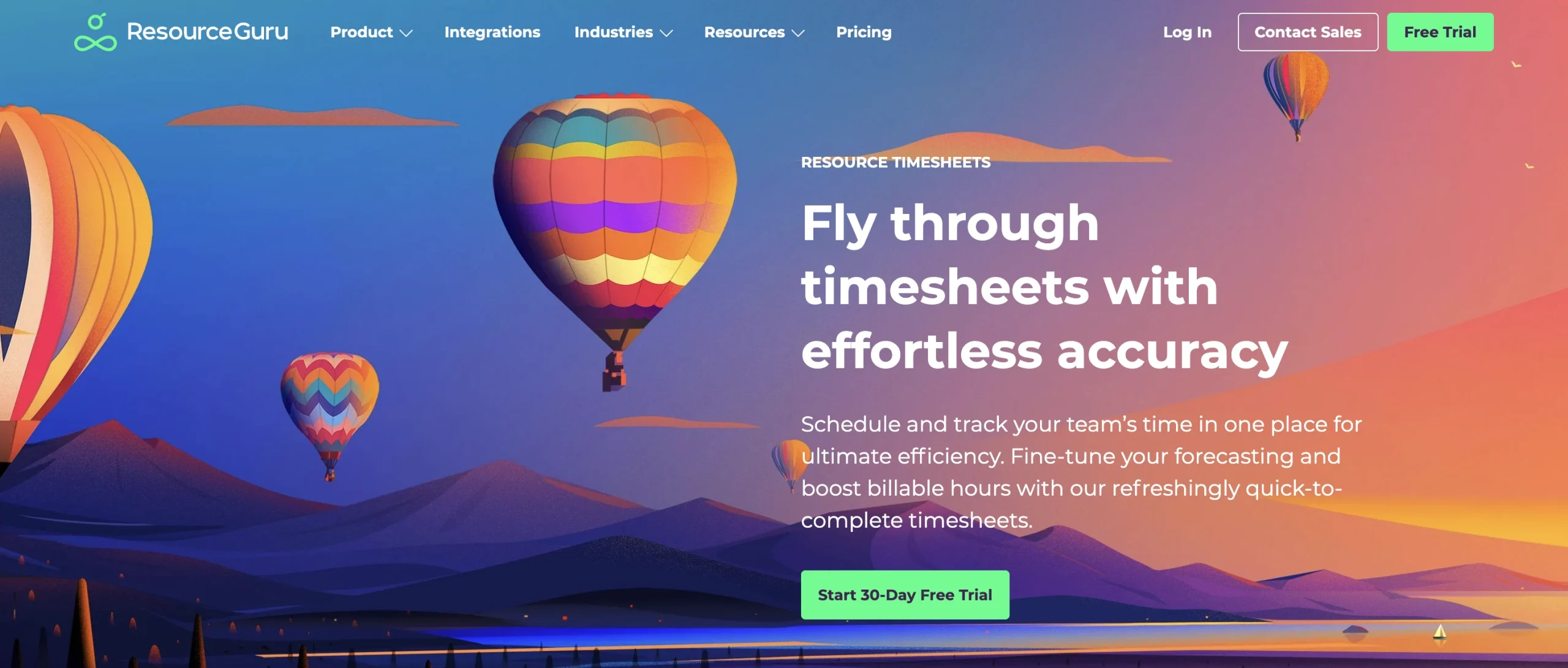
Best practice to steal: Use animations, GIFs, or explainer videos to show how your product works, rather than static screenshots.
Resource Guru truly embodies the “show, don’t tell” marketing philosophy.
Its Timesheets product page is a great example. Rather than just describing how bulk-logging or timesheet approval work, Resource Guru shows screen recordings of the actual product.
A short product video, even a simple screen recording with motion, communicates in ten seconds what three paragraphs of copy can’t.
Decentriq’s Collaborative Audience Platform
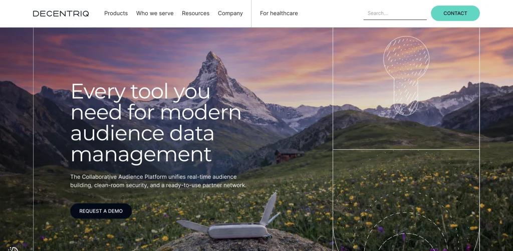
Best practice to steal: If your product is technically complex, use simple language and visual cues to communicate what it is and how it can help the readers.
Decentriq’s Collaborative Audience Platform is a good example of how to market a technically complex B2B product without overwhelming the reader.
The page opens with a straightforward promise: “Every tool you need for modern audience data management.”
The supporting copy immediately explains what that means, positioning the platform as a combination of real-time audience building, clean-room security, and access to a partner network.
The platform also utilizes a lot of visual cues, like short video content and illustrations, to break down complex features into easy-to-understand concepts.
B2B Service Page Examples
B2B service pages need to do more than explain what you offer. They also need to build trust, communicate expertise, and give prospective clients a reason to choose you over another provider.
The strongest examples make the service feel tangible through clear positioning, persuasive copy, and proof that the business can actually deliver.
Don’t Panic London’s homepage
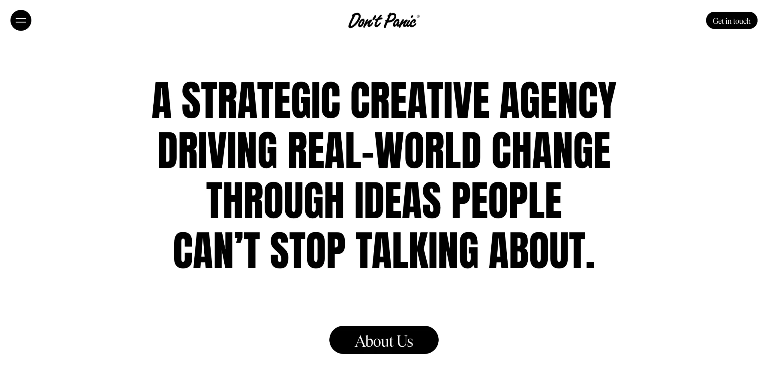
Best practice to steal: If you sell creative services, treat your landing page as a showcase of the creativity clients can expect from you.
Don’t Panic London is a creative marketing agency that promises to make work that stops people mid-scroll, and its homepage does a great job of showing what that looks like in practice.
Rather than relying on generic agency copy, the page uses bold, playful language that immediately gives the brand a distinct personality.
For a creative agency, that matters. The copy itself becomes proof of the creativity clients are paying for.
Proven Partners’ homepage
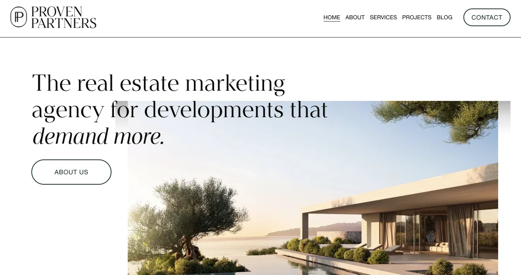
Best practice to steal: Identify your unique positioning or value proposition, then communicate it clearly in your copy.
Proven Partners isn’t just your average real estate marketing agency. As an international developer themselves, they know how to plan, develop, and manage both residential and commercial properties as well.
That gives Proven Partners a point of difference many competing agencies can’t claim, and its homepage makes the most of it.
Rather than positioning the company as simply a marketing supplier, the copy presents Proven Partners as a strategic partner that understands the entire development lifecycle, from initial planning and brand positioning through to sales and marketing.
Position Digital's SaaS SEO service page
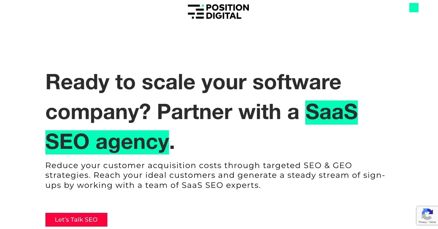
Best practice to steal: Use highly relevant yes-or-no questions to create instant alignment with your target audience.
One of my favourite B2B copywriting techniques is using questions in headings and body copy, especially questions your ideal customer is likely to answer with “yes”.
That’s the approach I use on our SaaS SEO service page. The headline “Found product market fit?” speaks directly to SaaS founders who have validated their product and are now thinking about scalable customer acquisition.
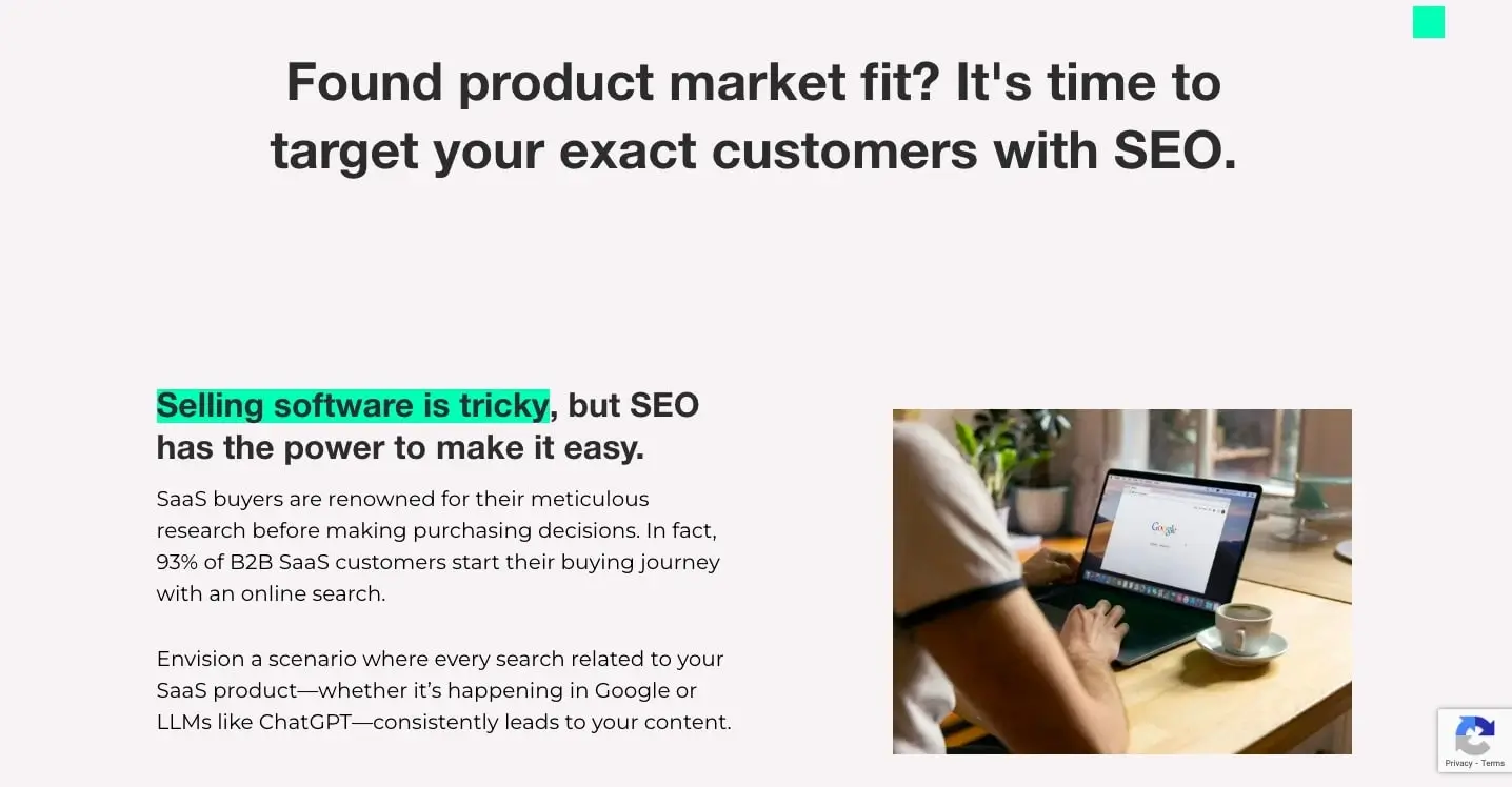
By framing the message as a question, the page encourages prospects to recognize themselves in the problem before we introduce SEO as the solution.
The rest of the section builds on that agreement by explaining why SEO can be a stronger long-term acquisition channel than relying heavily on PPC, before reinforcing the message with client testimonials and case studies.

B2B SaaS Features Page Examples
B2B features pages need to turn individual product capabilities into clear reasons to buy.
The best examples don’t just list what a platform can do. They connect each feature to a specific problem, outcome, or use case so prospects immediately understand why it matters.
Data Poem’s Growth Planning solution
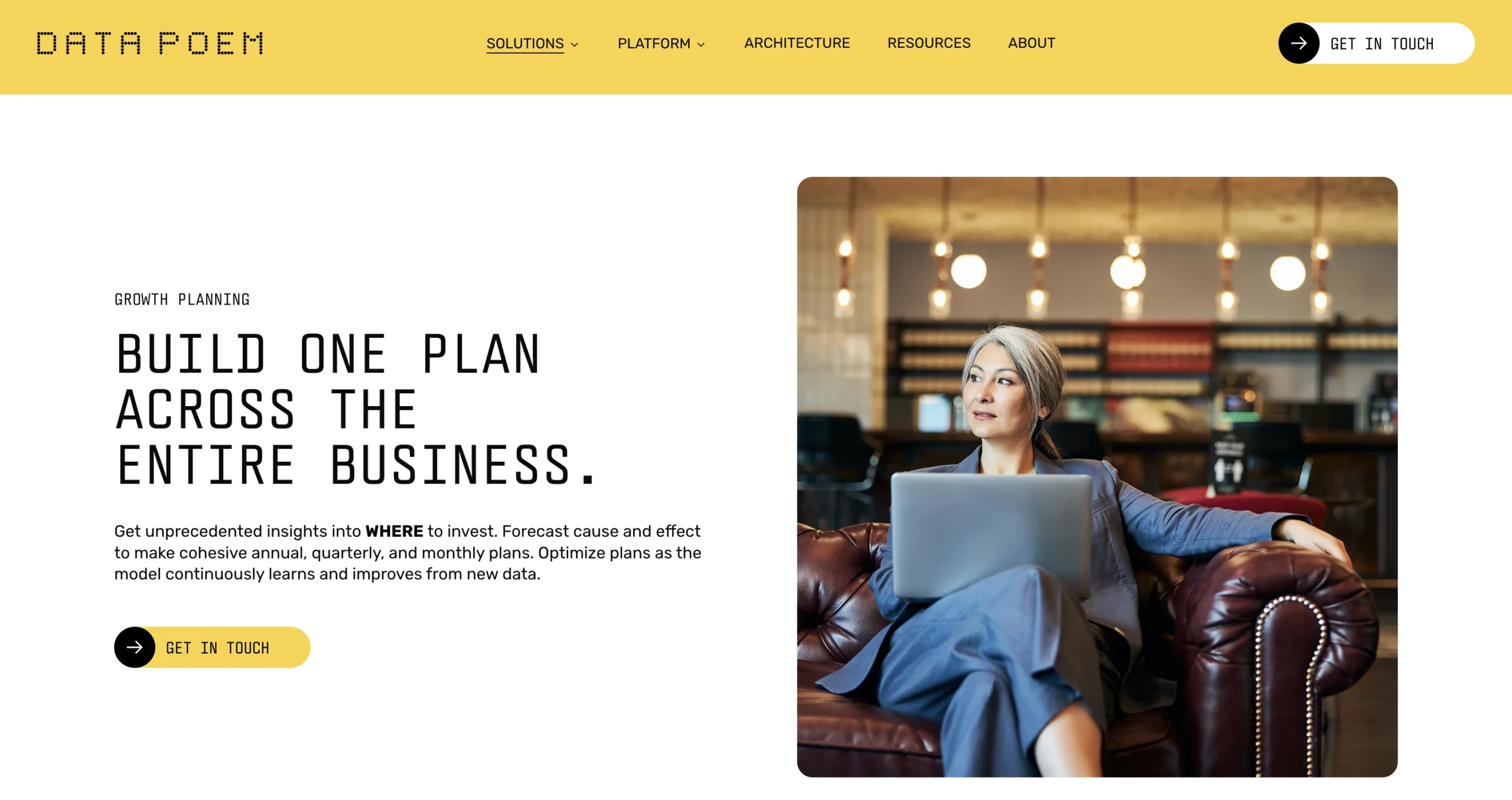
Best practice to steal: Before introducing your features, clearly show the problems with the status quo so readers immediately understand why your solution matters.
Data Poem does this particularly well on its Growth Planning page.
Before explaining the platform itself, the page walks through how finance, marketing, sales, pricing, and strategy teams often build separate plans based on different assumptions.
The result is a fragmented planning process where every team is working from its own version of the truth.
Only then does Data Poem introduce its solution: one causal model that connects those different growth drivers into a single plan and forecast.
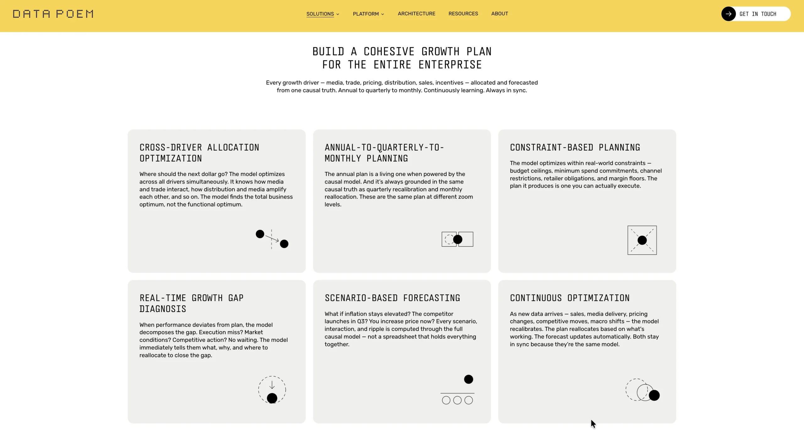
By establishing the problem first, the features that follow, from scenario forecasting to cross-driver optimisation, feel like direct solutions rather than a list of disconnected capabilities.
HR Datahub’s features page
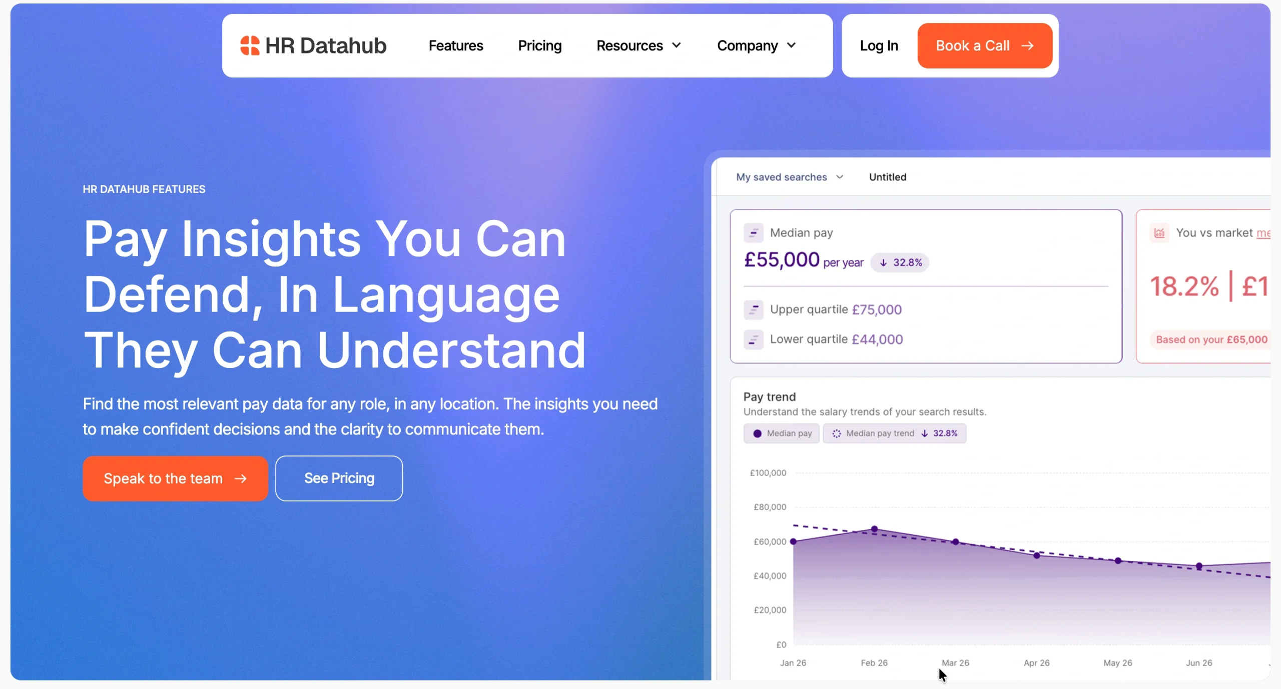
Best practice to steal: Don’t just list features. Connect each one to the problem it solves and the outcome it creates.
HR Datahub’s features page does this perfectly. Each feature ties back to a specific use case HR professionals are likely to encounter, making it immediately clear why the functionality matters.
For example, collections are framed around spotting pay gaps across teams, saved searches around keeping benchmarking consistent, and competitor search around making better-informed offers.
On top of that, HR Datahub includes a short video for each feature, showing exactly how it works in practice rather than relying on copy alone.
The result is a page that feels less like a feature inventory and more like a series of reasons to buy.
B2B SaaS Integrations Page Example
A strong B2B SaaS integrations page should do more than list compatible tools. It should show how those integrations fit into the customer’s existing workflow and make the product more useful.
Resource Guru’s integrations page
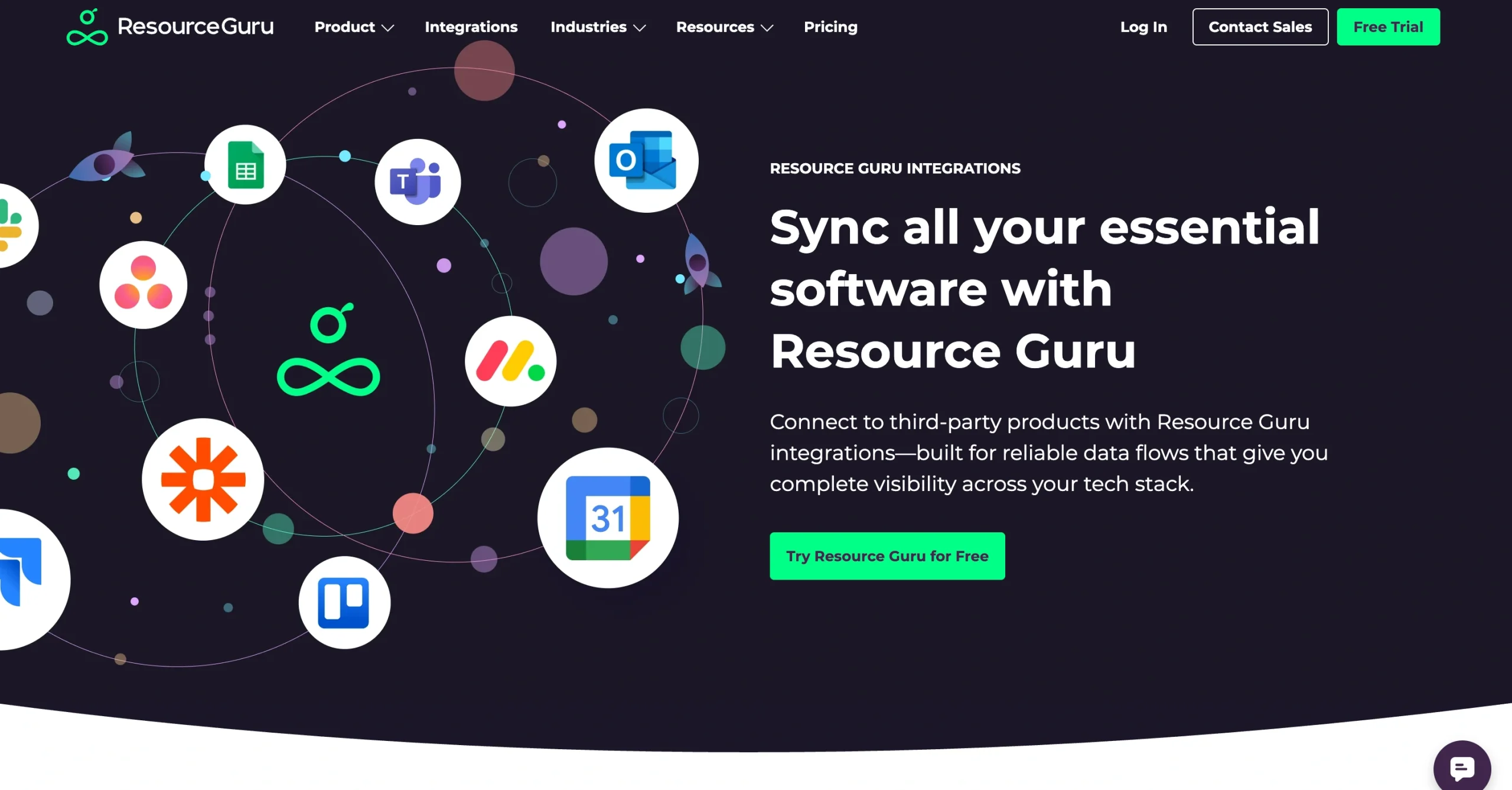
Best practice to steal: Don’t just show which tools you integrate with. Explain what each integration actually helps users accomplish.
Resource Guru makes its integrations page easy to explore with a simple grid of recognizable tools, including Outlook, Google Calendar, Jira, Asana, Monday.com, and ClickUp.
Crucially, each integration comes with a short description of the benefit. Instead of simply displaying the Jira logo, for example, Resource Guru explains that users can schedule Jira tickets and understand spend on each sprint.
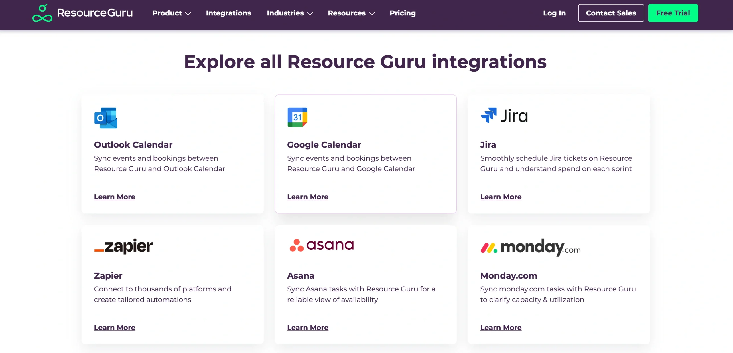
The page also caters to more advanced requirements by highlighting Zapier, its API, and AI integrations, showing prospective customers that they aren’t limited to the native integrations listed on the page.
B2B Lead Magnet Page Examples
The strongest lead magnet pages make the value obvious before asking users to hand over their contact details.
HR Datahub’s UK pay transparency report
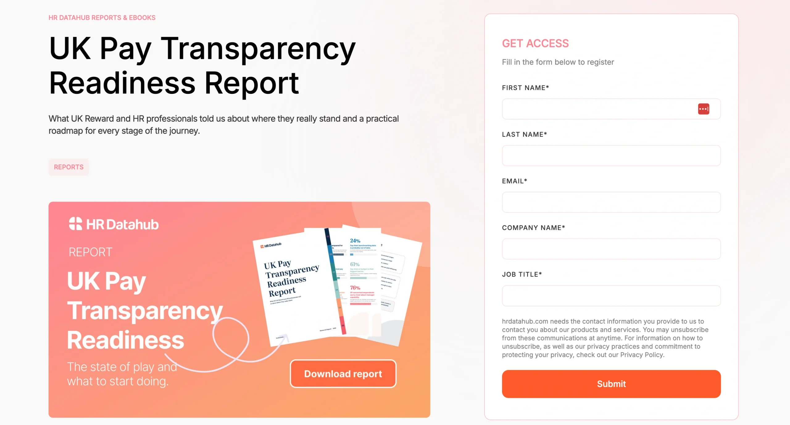
Best practice to steal: Show prospects exactly what they’ll get before asking for their contact details.
HR Datahub keeps the “UK Pay Transparency Report” landing page focused on one action: accessing the report.
A clear headline establishes what the resource is, while the supporting copy quickly explains why it matters to the target audience.
Rather than hiding all the value behind the form, the page gives a concise preview of the report’s key insights and contents.
This gives visitors enough information to decide whether the download is worth their details, without making the page unnecessarily long or distracting them from the main CTA.
Checkstep’s content moderation policies
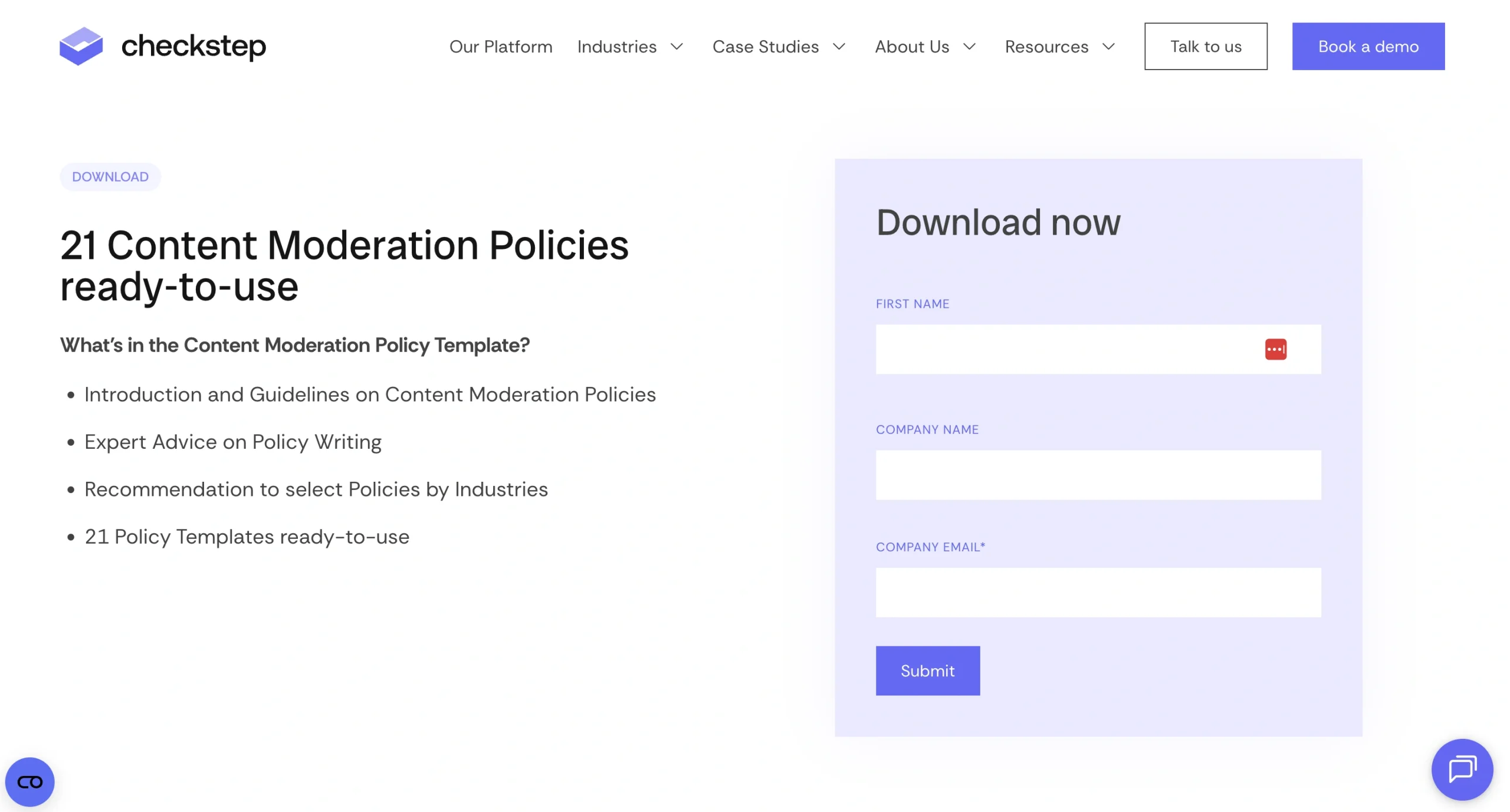
Best practice to steal: Keep the form short and only ask for the information you genuinely need.
Checkstep keeps its “content moderation policies” lead magnet page deliberately simple.
The headline tells visitors exactly what they’re getting, while a short list underneath previews what’s included in the download, such as policy-writing guidance and 21 ready-to-use templates.
Most importantly, the form doesn’t create unnecessary friction. Users simply need to enter their first name, company name, and company email address, and that’s it.
For a free resource, asking prospects to complete a long list of fields can quickly make the download feel like more effort than it’s worth.
By keeping the page and conversion process focused, Checkstep makes it easy for interested visitors to understand the offer and take the next step.
B2B Pricing Page Example
Pricing pages have one main job: remove uncertainty. The best ones make it easy to understand what users will pay, what they’ll get, and which option is right for them.
OpenLens’ pricing page
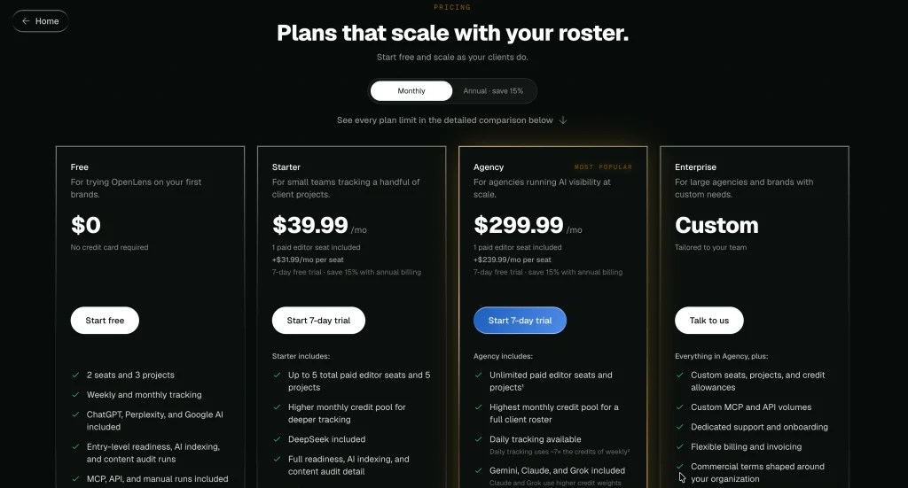
Best practice to steal: Make it easy for buyers to compare plans without speaking to sales.
OpenLens keeps its pricing page refreshingly transparent. Each tier has a clear price, a short description of who it’s for, and a concise breakdown of what’s included.
Visitors can quickly move from a free plan through Starter and Agency options, while the “Most popular” label helps steer higher-intent agency buyers towards the most relevant package.
For buyers who want more detail, a comparison table breaks down everything from projects and AI platforms to API allowances and reporting features. This lets prospects answer most of their pricing questions without booking a sales call.
The Anatomy of High-Performing B2B Landing Pages
If you hope to get some secret formulas for building a great landing page, sorry to disappoint you, but there’s no such thing.
However, from what I’ve seen, the best landing pages always have a few common traits:
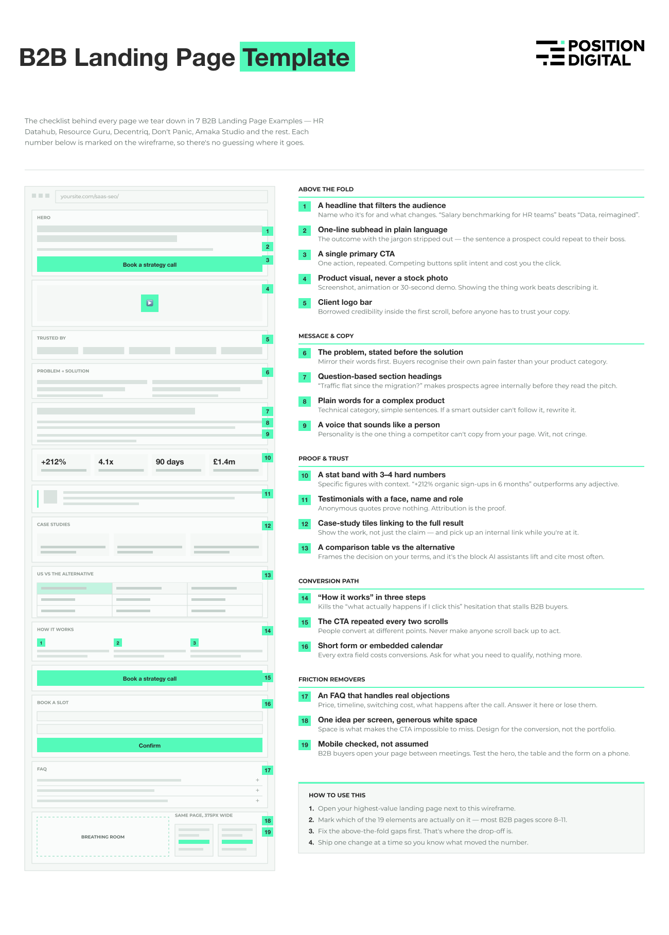
- A clear headline: It’s your first audience filter. Visitors will decide whether or not they’ve come to the right page just by reading the title.
- Visual cues: Don’t just rely on words; throw in some visuals: a chart, a screenshot, maybe a quick demo video. Show (don’t just tell) how your product works.
- Trust signals: People want to see proof before they hand over anything. Adding real statistics, client testimonials, and client logos is great for building trust.
- Clean design: The goal of your landing page isn’t to win some design awards; it’s to make people convert. Avoid overcomplicating stuff. Keep everything simple and easy to understand.
- Call-to-action (CTA): Make your CTA impossible to miss. It should spell out exactly what you want people to do next.
Of course, nothing’s set in stone. Feel free to experiment with different landing page layouts and see what actually works.
But before you start designing, take a little time up front to sketch out your landing page.
Want to see how it’s done? Check out this step-by-step guide on landing page wireframing I’ve put together for you.
B2B Landing Page Template
Download the editable B2B landing page template here (SVG file).
Key Takeaways
You’ve seen some of the best B2B landing page examples. Now it’s time to apply these winning principles to your own page:
- Know exactly what makes you unique.
- Communicate this uniqueness throughout the page.
- Use simple copy, clean design, and visual cues to get your point across fast.
- Back up your claims with testimonials, statistics, or client logos.
- Don’t be afraid to inject some personality; B2B decision makers are still humans with emotions.
And most importantly, keep refining your landing page. Great pages aren’t built overnight; they’re tested, improved, and optimized over time based on real user behavior.
If you’re ready to put these lessons into practice, partner with Position Digital.
We’ll help you create conversion-focused B2B landing pages that bring a steady stream of hot leads to your business.